Overview of the application UI
When you log in to your Forvio account, you will land on your dashboard. The design of the application interface is optimized for user ease, facilitating quick navigation to various parts of the Forvio flow.
Navigation
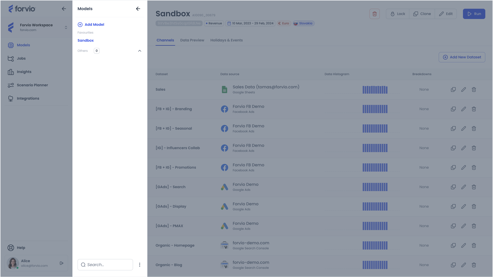
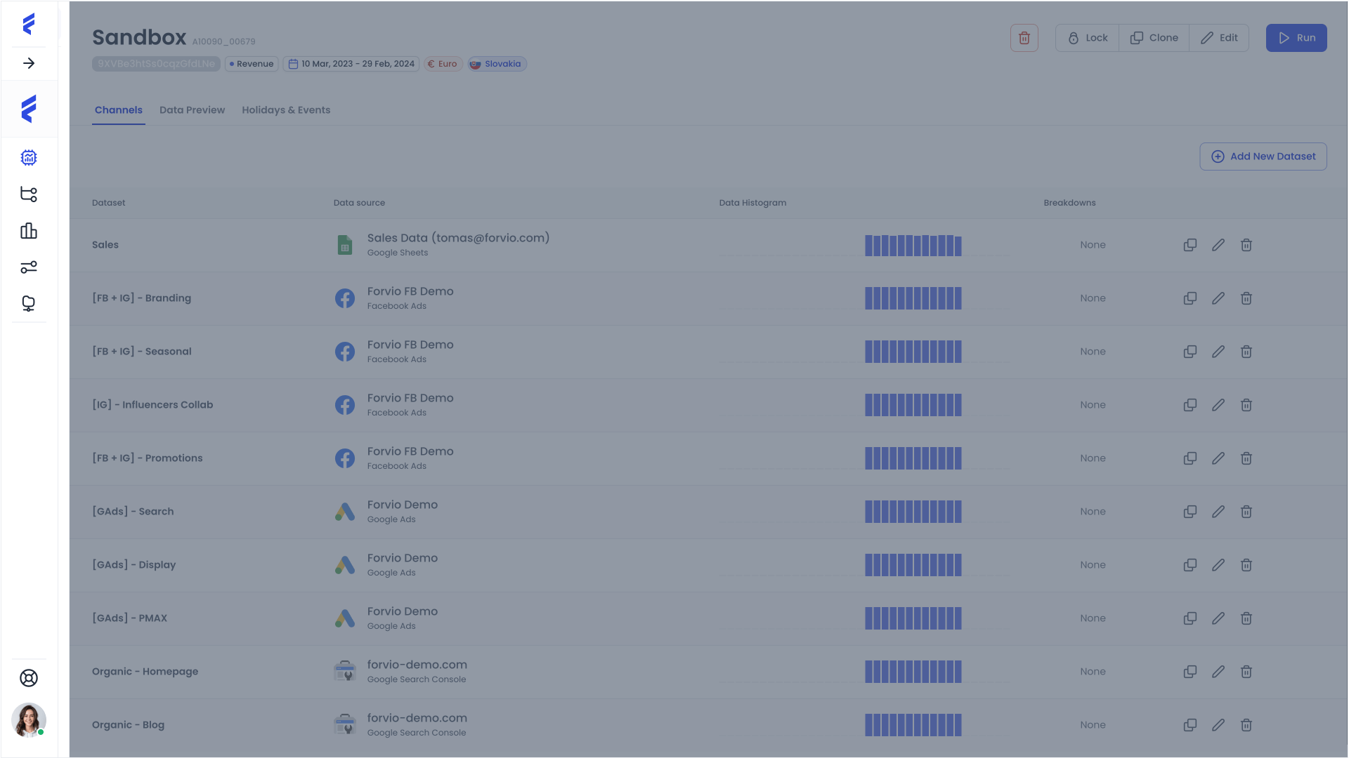
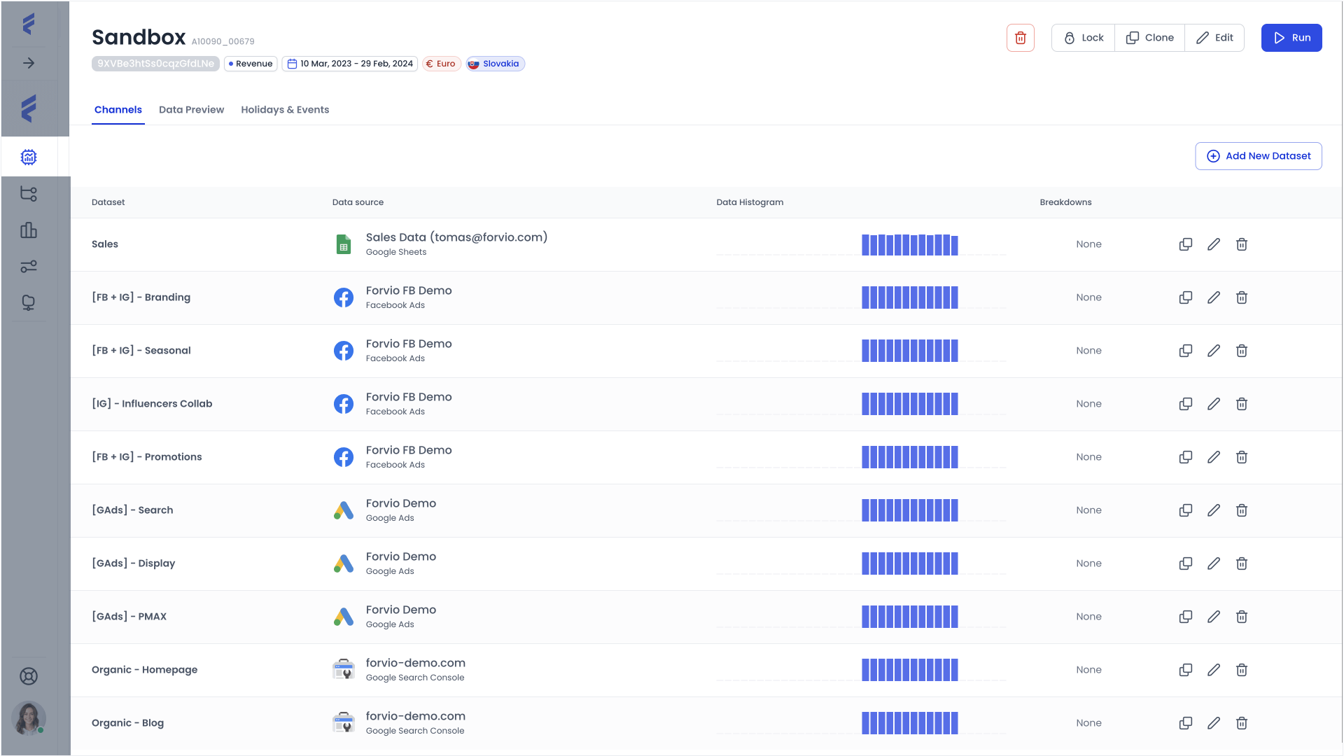
On the left side of the interface, you will find the navigation panel, which is divided into two levels.
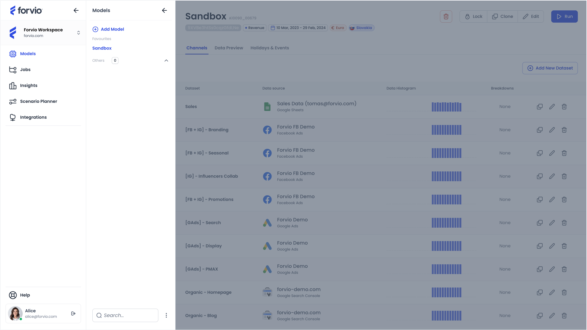
The first level contains links to individual sections of the Forvio flow such as Integrations, Model Builder, Insights, and Scenario Planner.
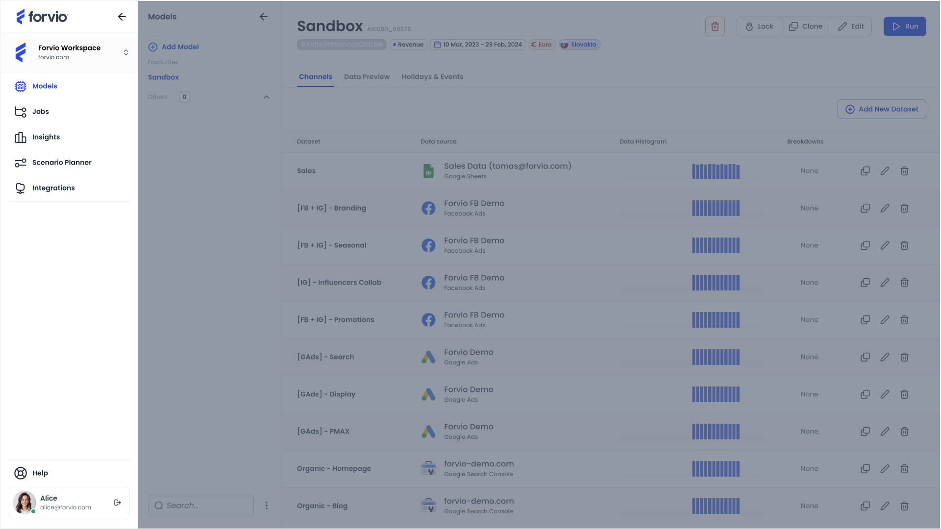
If your account and subscription support multi-workspace functionality, you can switch between different workspaces using a designated button. This feature is particularly useful when managing multiple clients, as it allows you to keep each client’s accounts separate.
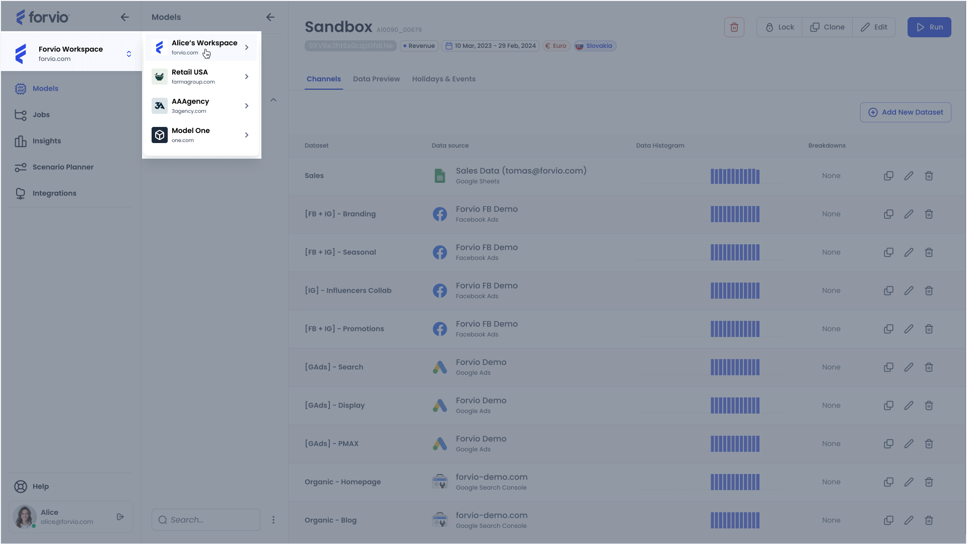
At the bottom of the menu, you will find links to the Account settings and the Help section, where you can access Documentation, FAQs, and the Support form. Additionally, there is a button displaying your account avatar, which you can use to log out of the application.
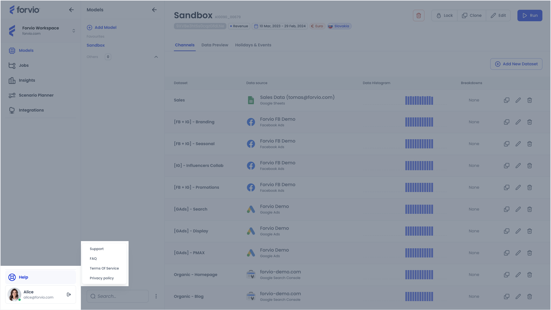
The second level menu displays the individual models you have created, organized into two distinct sections: 1. Favourites and 2. Other. You can keep the models that are most important to you in the Favourites section and place the less important ones in the Other section. This arrangement enhances organization and simplifies navigation among your models.
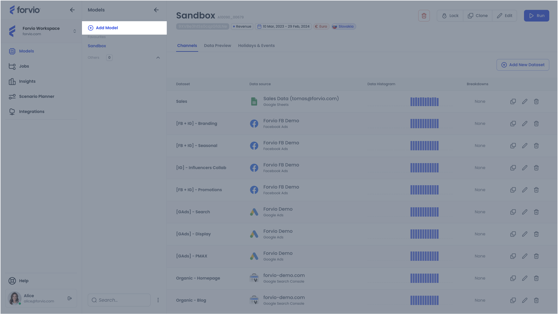
Additionally, the second level menu features an Add Model button, allowing for the quick creation of new models.
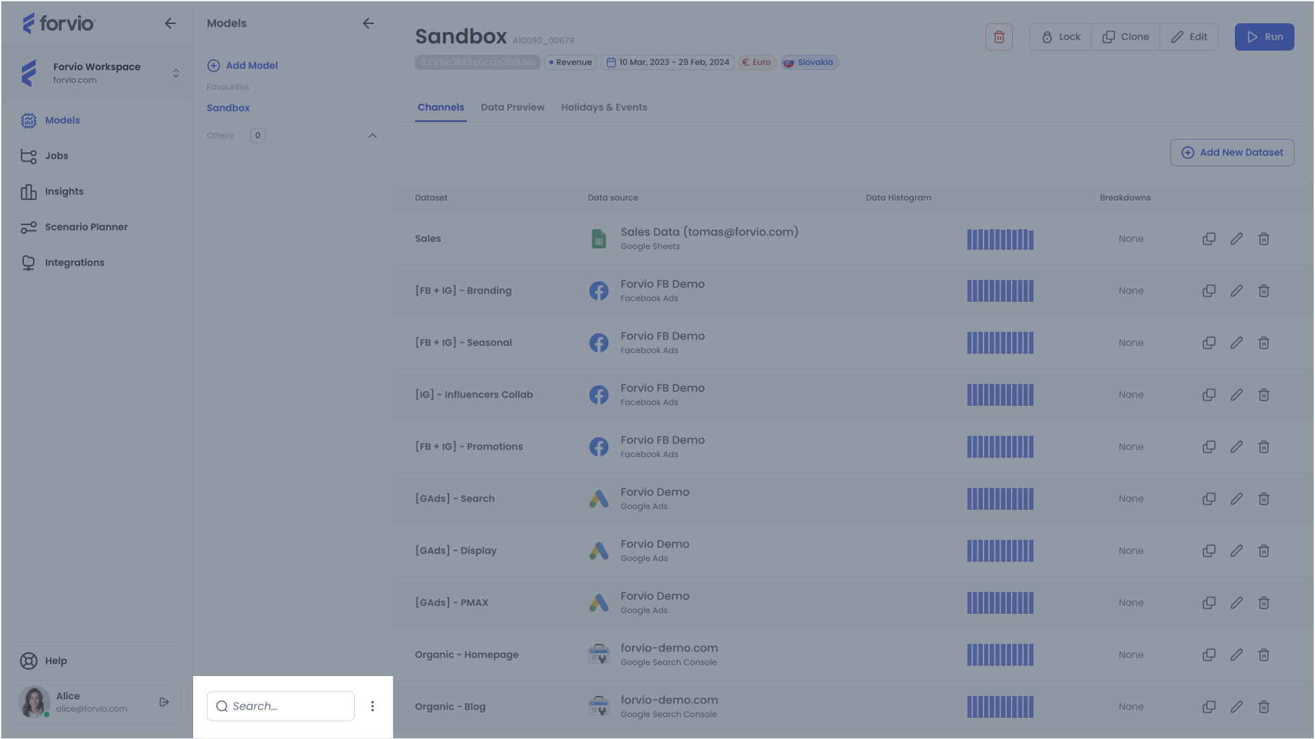
For the function of searching and various sorting of models in the lists, you can use the corresponding controls located at the bottom of this menu.
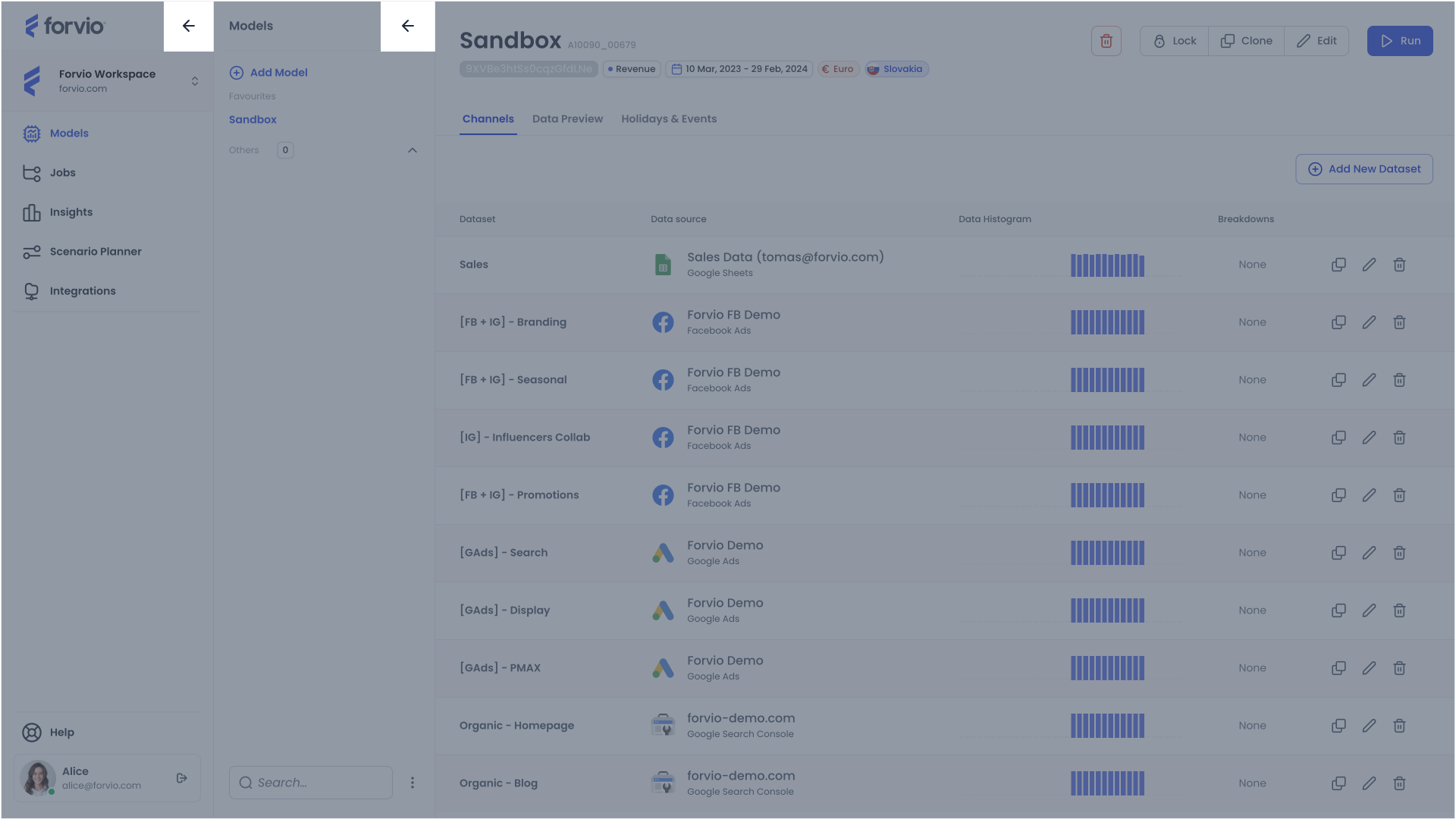
Content section
To the right of the menu is the main area of the application, which changes based on the selected model (from menu level 2) and the chosen section of the application flow (from menu level 1).
Each flow section is described in more detail in the corresponding site of the documentation: